
Css样式收藏
大约 9 分钟
flex布局
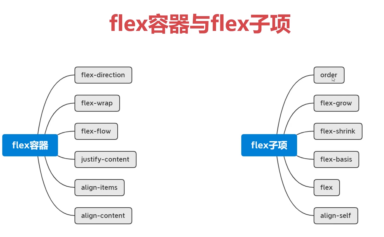
flex-direction
改变你主轴方向
flex-direction:colume
flex-wrap
换行
flex-direction:warp
flex-flow
flex-direction flex-wrap 的缩写
flex-flow: colume warp
justidy-content 水平对齐
主轴对齐方式
justify-content: space-between;
align-items
每一行的对齐方式
align-items: center; /*垂直居中*/
align-center
交叉轴对齐方式,当不折行的情况下不会生效
align-content: flex-end;
flex-item 子项
flex-grow扩展宽度
默认值:0,不占用剩余的空白间隙扩展自己的宽度
在flex布局中,如果某一行只有一个子项,其他的空间是空白的,设置这个值可以扩展整行的宽度
如果有2个子项,会均等分后扩展剩余空间
flex-grow: 0-1 // 0.5:剩余空余的50%


<!doctype html>
<html lang="en">
<head>
    <meta charset="UTF-8">
    <meta name="viewport"
          content="width=device-width, user-scalable=no, initial-scale=1.0, maximum-scale=1.0, minimum-scale=1.0">
    <meta http-equiv="X-UA-Compatible" content="ie=edge">
    <title>flex</title>
    <style>
        body{
            padding: 0;
            margin: 0;
        }
        .main{
            height: 100px;
            background-color: #cccc;
            display: flex;
         }
        .main div{
            background-color: #ff0000;
            width: 100px;
            height: 100px;
            flex-grow: 1; // 扩展了剩余空间
        }
    </style>
</head>
<body>
<div class="main">
    <div></div>
</div>
</body>
</html>
flex-shrink 收缩
默认值是:1,表示flex容器空间不足时,元素的收缩比例
flex-shrink: 0-1
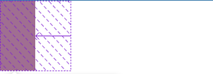 默认显示的样子
 当红色的子项大于灰色父元素的宽度的时候,会显示超出部分的区域
<!doctype html>
<html lang="en">
<head>
    <meta charset="UTF-8">
    <meta name="viewport"
          content="width=device-width, user-scalable=no, initial-scale=1.0, maximum-scale=1.0, minimum-scale=1.0">
    <meta http-equiv="X-UA-Compatible" content="ie=edge">
    <title>flex</title>
    <style>
        body{
            padding: 0;
            margin: 0;
        }
        .main{
            width: 50px;
            height: 200px;
            background-color: #cccc;
            display: flex;
         }
        .main div{
            background-color: #ff0000;
            /*子项的宽度大于了父项的宽度,所以子项的宽度会自动缩小*/
            width: 100px;
            height: 100px;
            /*设置为0的时候,溢出的部分还是会显示*/
            flex-shrink: 0;
        }
    </style>
</head>
<body>
<div class="main">
    <div></div>
    <!--<div></div>-->
</div>
</body>
</html>
flex-basis
主轴的尺寸大小
width: 100px;
flex-basis: 200px;
flex
flex-grow flex-shrink flex-basis 缩写
align-self 垂直对齐方式
控制单独某个flex子项的垂直对齐方式
align-self: auto;
order
改变子项的排列顺序
order: 1; // -1 > 0 -> 1
两列布局
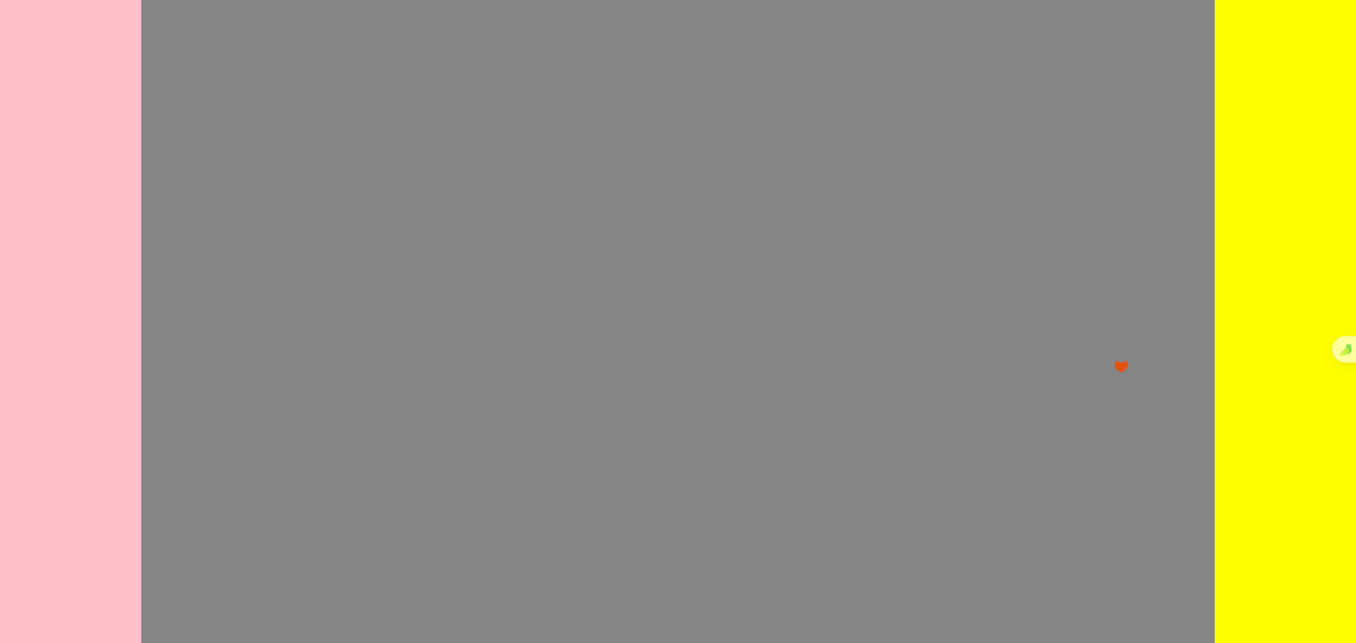
<template>
    <div class="main">
        <div class="col1"></div>
        <div class="col2"></div>
        <div class="col3"></div>
    </div>
</template>

<style scoped>
.main{
    background-color: skyblue;
    display: flex;
   height: 100vh;
}
.col1{
    width: 200px;
    background-color: pink;
}
.col2{
    flex-grow: 1;
    background-color: #868585;
}
.col3{
    width: 200px;
    background-color: yellow;
}
</style>
sticky footer
当中间的内容少的时候会在底部显示,内容多撑开
<template>
    <div class="main">
        <div class="header"></div>
        <div class="content">
            <p v-for="index in 100" :key="index">这是测试内容</p>
        </div>
        <div class="footer"></div>
    </div>
</template>

<style scoped>
.main{
    min-height: 100vh;
    display: flex;
    flex-direction: column;
}
.header{
    height: 100px;
    background-color: pink;
}
.content{
    flex-grow: 1;
}
.footer{
    height: 200px;
    background-color: black;
}
</style>
溢出项布局-tab切换
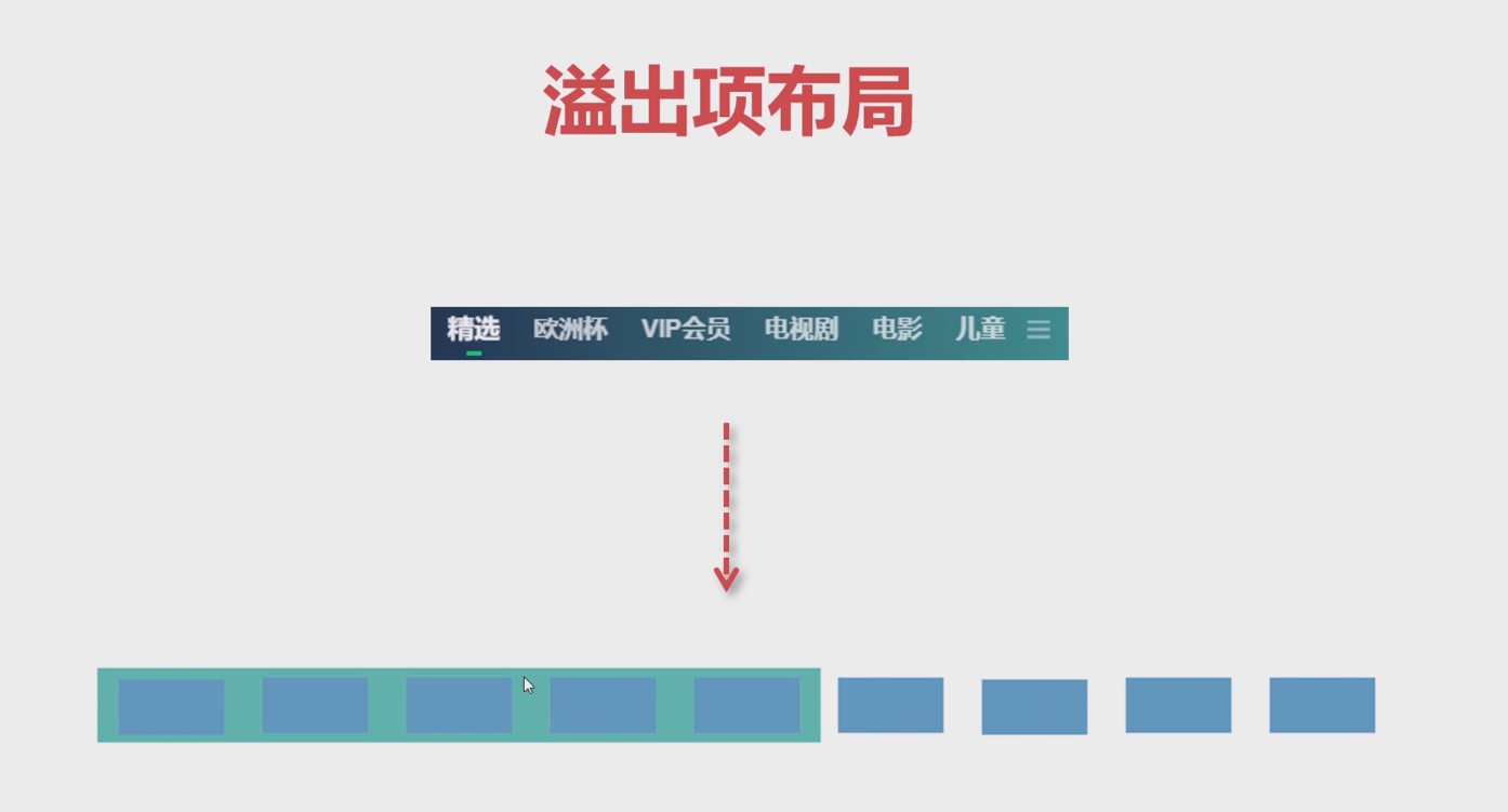
导航栏多余的隐藏
<template>
    <div class="main">
        <div v-for="(item,index) in 20" :key="index">
			<a>菜单{{index+1}}</a>
		</div>
    </div>
</template>
<style scoped lang="scss">
.main{
    height: 60px;
	background-color: gray;
	display: flex;
	overflow-x: scroll; // 溢出的内容可以滚动
	div{
		width: 50px;
		height: 50px;
		padding: 0 10px;
		line-height: 50px;
		margin-right: 10px;
		flex-shrink: 0; // 溢出出现滚动条
	}
	div:nth-of-type(1) {
		color: white;
		a{
			display: inline-block;
			border-bottom:  2px solid white; // 只需要文字的宽度有下滑线而不是整个子项的div有下滑线
		}
	}
}
</style>
导航左右两端布局-分组布局

<!doctype html>
<html lang="en">
<head>
    <meta charset="UTF-8">
    <meta name="viewport"
          content="width=device-width, user-scalable=no, initial-scale=1.0, maximum-scale=1.0, minimum-scale=1.0">
    <meta http-equiv="X-UA-Compatible" content="ie=edge">
    <title>flex</title>
    <style>
        body{
            padding: 0;
            margin: 0;
        }
        .main{
            margin: 0 auto;
            height: 100px;
            background-color: #cccc;
            display: flex;
            padding: 0 10px;
         }
        .flex-item{
            width: 100px;
            height: 100px;
            background-color: #ff0000;
            font-size: 30px;
            text-align: center;
            line-height: 100px;
            align-items: center; /*垂直居中*/
        }
        .main div:nth-of-type(1){
            margin-right: auto; /* 会拉伸右边区域,将右边的元素挤到最右边 */
        }
        .main div:nth-of-type(3){
            margin-left: 10px;
        }
    </style>
</head>
<body>
<div class="main">
    <div class="flex-item">首页</div>

    <div class="flex-item">登录</div>
    <div class="flex-item">注册</div>
</div>
</body>
</html>
定位
绝对定位
- 元素相对于其最近的已定位(非 static)祖先元素进行定位。
- 如果没有已定位的祖先元素,则相对于初始包含块(通常是文档体)进行定位。
- 元素脱离文档流,不占据空间,因此不会影响其他元素的布局。
.absolute-element {
  position: absolute;
  top: 20px;
  right: 30px;
}
相对定位
- 元素相对于其正常位置进行偏移。
- 元素仍然占据其原始空间,即不脱离文档流。
- 可以使用
top和bottom属性沿垂直方向移动元素,使用left和right属性沿水平方向移动元素。
.relative-element {
  position: relative;
  top: 20px;
  left: 30px;
}
一般是先绝对定位,然后在相对定位
grid
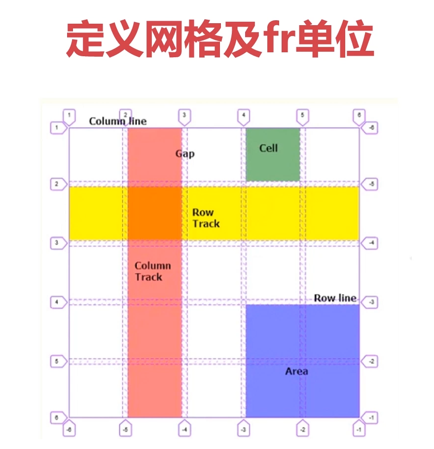
父级容器
display: grid;
grid-template-rows: repeat(3, 1fr); // 定义行
grid-template-columns: repeat(3, 1fr); // 定义列


display: grid;
grid-template-columns: 1fr 300px; // 当前列的第二个网格设置比例
grid-template-rows: 0.3fr 0.5fr; // 相对当前行的比例
合并网格
<div class="main">
    <div v-for="i in 3" :key="i">{{ i+1 }}</div>
</div>

.main{
    width: 300px;
    height: 300px;
    background-color: #f0f0f0;
    display: grid;
    grid-template-columns: repeat(3, 1fr);
    grid-template-rows: repeat(3, 1fr);
    grid-template-areas: // 会按照这个形状进行布局
"a1 a1 a2"
"a1 a1 a2"
"a3 a4 a4";
}
.main div:nth-child(1){
    grid-area: a1;
}
.main div:nth-child(2){
    grid-area: a2;
}
.main div:nth-child(3){
    grid-area: a3;
}
设置行列的间距
row-gap: 20px; // 行间距
column-gap: 30px; //  列间距
grid-gap: 20px 30px; // 行 列
// 相等效果
gap:20px 30px; // 行 列
对齐方式
指定子项在网格中的对齐方式
display: grid;
justify-items: start; // 定义子项的 水平对齐方式
align-items: end; // 定义子项的 垂直对齐方式
place-items: end start; // 列 行
指定了所有网格在grid容器中的对齐方式
// 容器要比单元格大
justify-content: start; // 水平方式
align-content: end; // 述职方式
place-content: end start; // 列 行
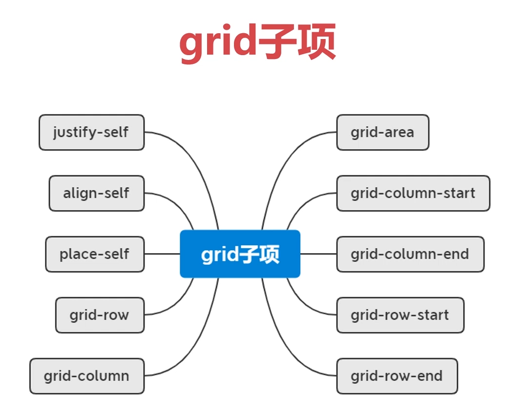
grid子项
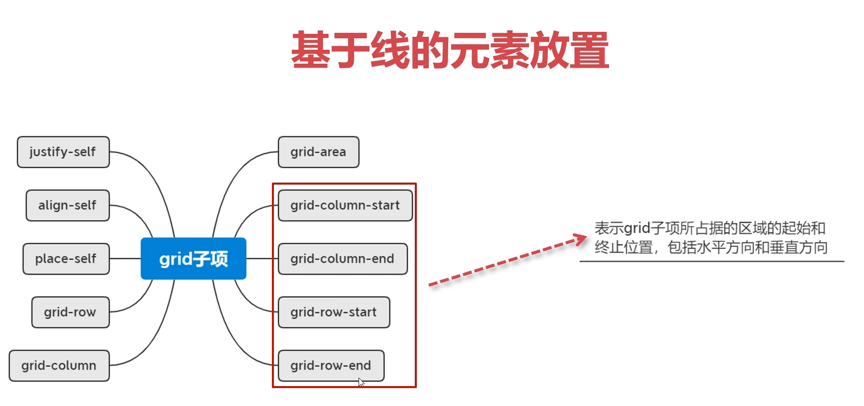
.main div{
    grid-column-start: 2; // 行编号
    grid-column-end: 2;
    grid-row-start: 2; // 列 编号
    grid-row-end: 4;
}
.grid-item {
  grid-area: row-start / column-start / row-end / column-end;
}
叠加布局 - grid-area
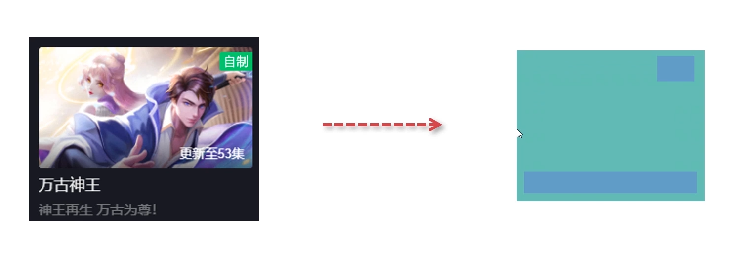

<template>
<div class="main">
    <img src="../assets/1.jpg" alt="">
    <span>动漫</span>
    <p>更新至100集</p>
</div>
</template>

<style scoped>
.main{
    width: 300px;
    height: 300px;
    background-color: #f0f0f0;
    display: grid; // 父元素使用 grid 布局
    color: white;
}
.main img{
    width: 100%;
    grid-area: 1/1/1/1;
}
.main span{
    grid-area: 1/1/1/1;
    justify-self: end; // 相对自己
    padding: 10px 30px;
}
.main p{
    margin:0;
    grid-area: 1/1/1/1;
    align-self: end; // 相对自己
    background-color: rgba(140, 139, 139, 0.8);
    height: 30px;
    line-height: 30px;
    text-align: right;
    padding-right: 20px;
}

</style>
父级元素

<template>
<div class="main">
    <div v-for="i in 6" :key="i">{{ i+1 }}</div>
</div>
</template>

<!--3*3排列,并且有点间隙-->
<style scoped>
.main{
    width: 300px;
    height: 300px;
    background-color: #f0f0f0;
    display: grid;
    grid-template-columns: repeat(3, 1fr);
    grid-template-rows: repeat(3, 1fr);
    gap: 3px;
}
.main div{
    background-color: pink;
}

.main div:nth-child(1){
    grid-area: 1/1/span 2/span 2;
}
</style>
<script setup lang="ts">
</script>
字数截断
.text-truncate {
  width: 100px;           /* 需要有一个固定宽度 */
  white-space: nowrap;    /* 保持文本在一行显示 */
  overflow: hidden;       /* 隐藏超出部分的文本 */
  text-overflow: ellipsis; /* 使用省略号表示截断 */
}
多行保留指定的行
.there-line{
  display: -webkit-box;
  -webkit-box-orient: vertical;
  -webkit-line-clamp: 1;  /* 保留指定的行数 */
  overflow: hidden;
}
图片
滚动条
.main {
    height: 100%;
    overflow-y: auto;
    overflow-x: hidden;
}

/* 滚动条的轨道 */
.main::-webkit-scrollbar {
    width: 13px; /* 宽度 */
}

/* 滚动条的滑块 */
.main::-webkit-scrollbar-thumb {
    background-color: #cccccc; /* 滑块颜色 */
    border-radius: 5px; /* 圆角 */
}

/* 滚动条的轨道背景 */
.main::-webkit-scrollbar-track {
    background-color: #f1f1f1; /* 轨道背景色 */
}

/* 滚动条上下按钮(箭头) */
.main::-webkit-scrollbar-button {
    display: none; /* 隐藏按钮 */
}
图片渐变
background-image: linear-gradient(0deg,rgba(29,41,49,.5),rgba(255,255,255,0));
字体颜色
--key-color: #333;
--main-color: #4e5358;
--main-shadow: rgba(116, 116, 116, 0.08);
--muted-color: #777;
--muted-2-color: #999;
--muted-3-color: #b1b1b1;
--body-bg-color: #f5f6f7;
--main-bg-color: #fff;
--muted-bg-color: #eee;
光影质感(最显高级)
/* 基础柔和阴影(最常用) */
box-shadow: 0 2px 8px rgba(0, 0, 0, 0.08);
/* 卡片悬浮强化阴影 */
box-shadow: 0 8px 24px rgba(0, 0, 0, 0.12);
/* 内阴影(凹陷质感) */
box-shadow: inset 0 1px 3px rgba(0, 0, 0, 0.06);


/* 文字轻微描边/投影 */
text-shadow: 0 1px 2px rgba(0,0,0,0.1);

/* 高级感必备,iOS/Windows 风格毛玻璃效果 */
backdrop-filter: blur(12px);
background: rgba(255,255,255,0.6);

/* border / outline 精致边框 */
border: 1px solid #e5e7eb;
outline: 2px solid rgba(59, 130, 246, 0.3);
outline-offset: 2px;

/* 高级图片叠加效果(海报 / 封面专用) */
mix-blend-mode: overlay;

/* 让所有 hover / 点击变化不生硬,是高级交互的基础 */
transition: all 0.25s cubic-bezier(0.25, 0.1, 0.25, 1);

/* 悬浮轻微上浮 */
transform: translateY(-2px);
/* 轻微缩放 */
transform: scale(1.02);

/* 标题、中文专用,立刻变精致 */
letter-spacing: 0.2px;
底部固定
 <div  style="position: fixed;bottom: 0px;left: 0;width: 100%;box-sizing: border-box">
    <div class="container" >
        <Button type="primary" long size="large" @click="showForm(activity.id)">立即报名</Button>
    </div>
</div>
关键知识点解释
- box-sizing: border-box(最核心)
- 作用:让元素的
width包含padding和border,比如容器width:100%+padding:20px,实际宽度还是 100%,不会超出屏幕; - 不设置的话:容器宽度会变成
100% + 40px(左右 padding),导致内部元素被挤偏或出现横向滚动。
- 作用:让元素的
- 固定定位的正确写法
- 用
left: 0代替margin-left: 50%; transform: translateX(-50%);:固定定位的容器设置left:0就能贴满屏幕宽度,无需额外的偏移计算,避免因计算误差导致内部元素偏移; - 如果非要用
transform:确保容器没有width:100%,或者transform只作用于内部元素,而非容器本身。
- 用
- 内部元素的宽度控制
- 内部元素设置
width: 100%:会自适应容器的 “有效宽度”(100% - 左右 padding),不会超出容器; - 如果想让按钮留边:把内部元素宽度设为
90%,保留margin: 0 auto,依然能居中且不偏移。
- 内部元素设置
避坑指南(常见错误对比)
| 错误写法(会偏移) | 正确写法(不偏移) |
|---|---|
width:100%; padding:20px; | width:100%; padding:20px; box-sizing: border-box; |
position:fixed; width:100%; margin-left:50%; transform: translateX(-50%); | position:fixed; width:100%; left:0; |
内部元素 margin-left: auto; margin-right: 0; | 内部元素 margin: 0 auto; 或 width:100%; |
总结
- 给 100% 宽度的容器加
box-sizing: border-box,避免 padding/border 导致宽度溢出; - 固定定位的容器用
left: 0代替transform/margin-left,减少偏移风险; - 内部元素通过
width:100%或margin: 0 auto适配容器,保证不偏移。